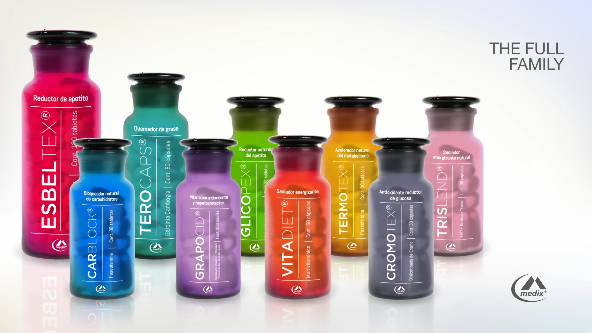
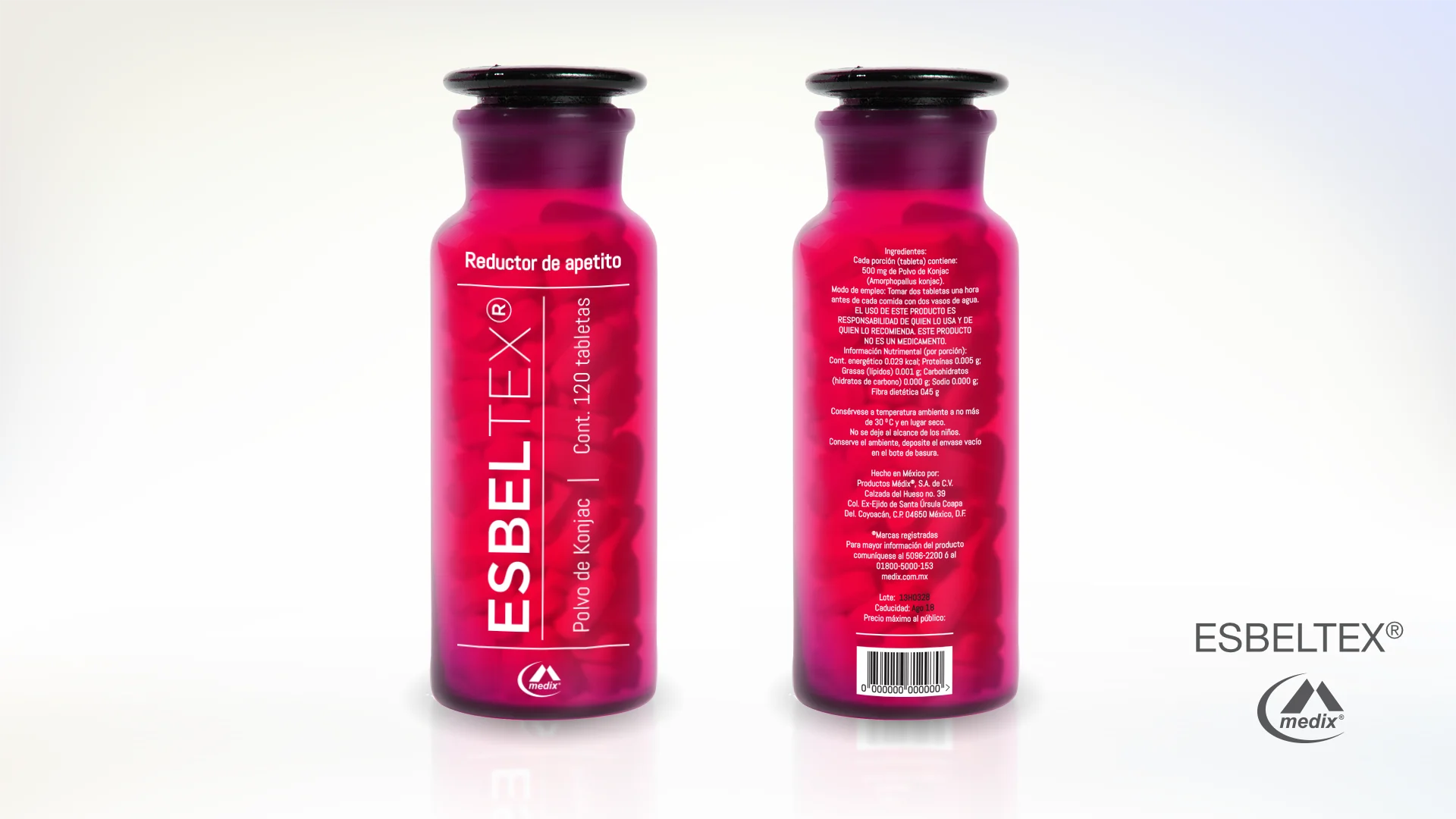
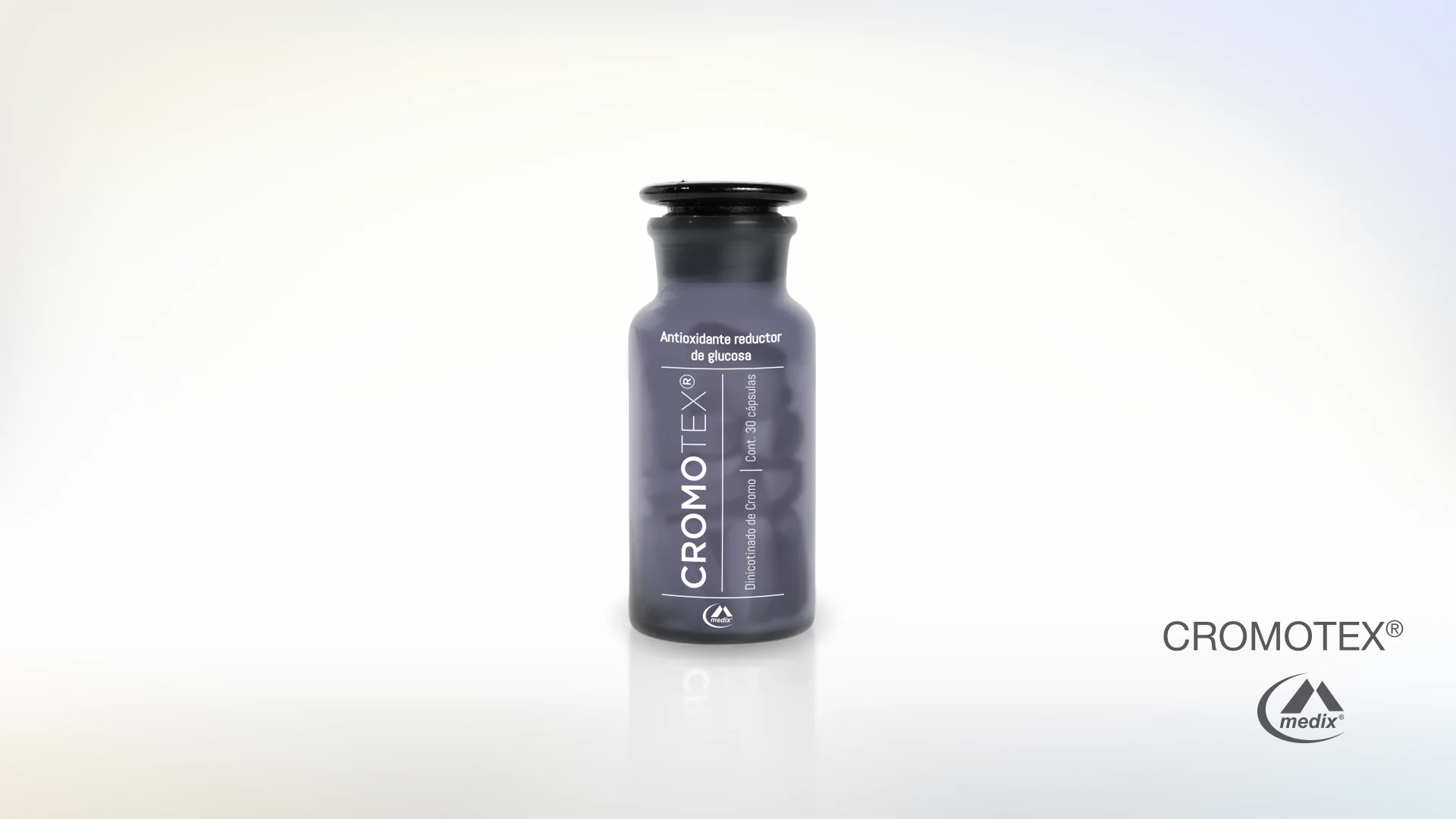
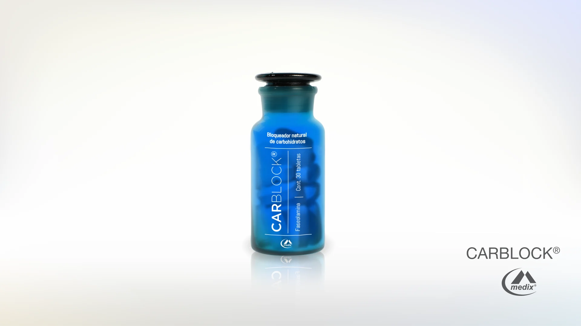
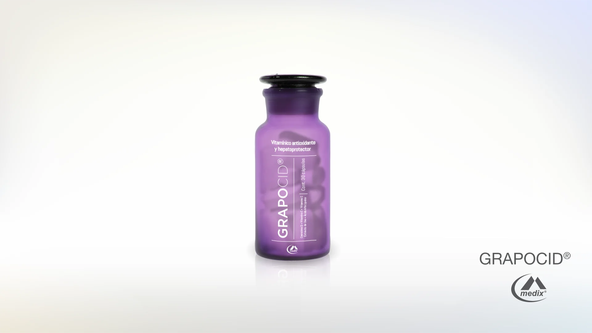
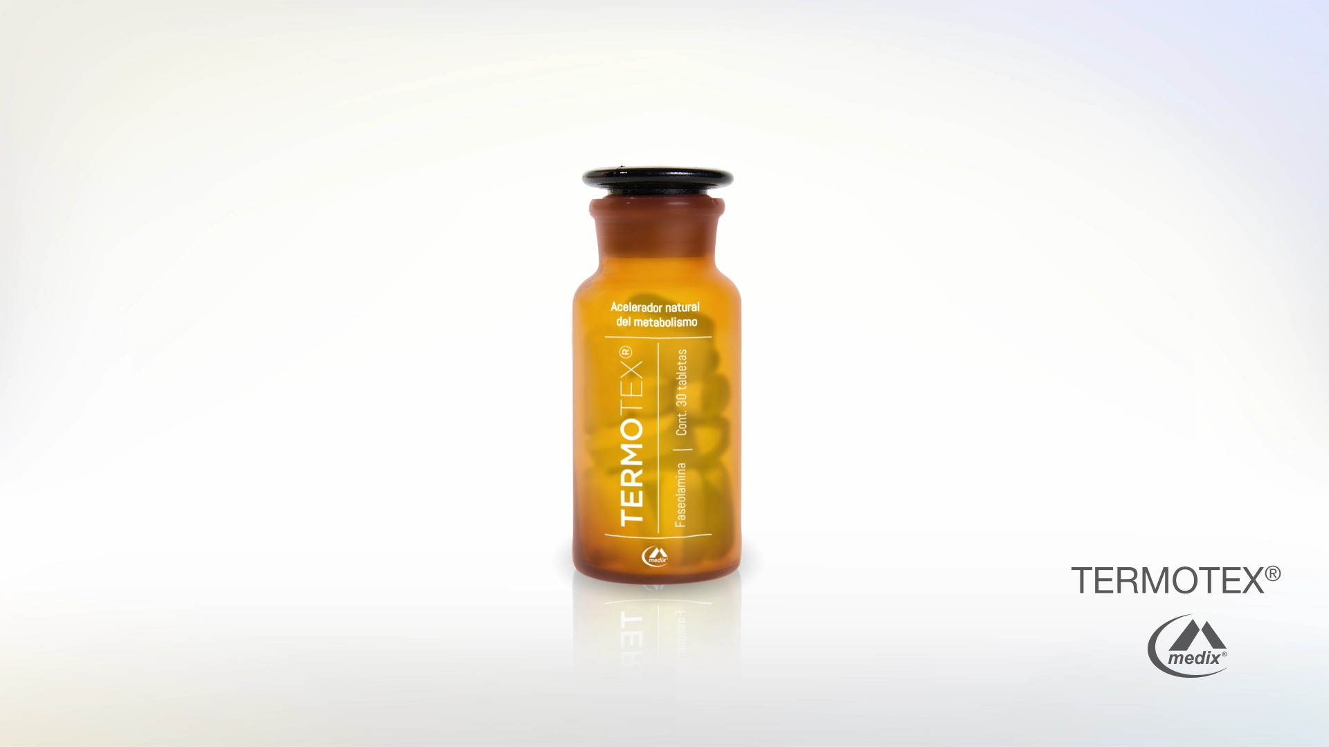
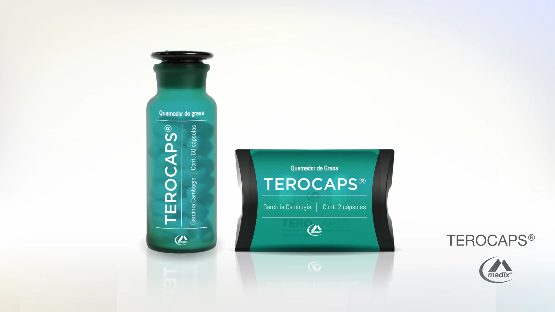
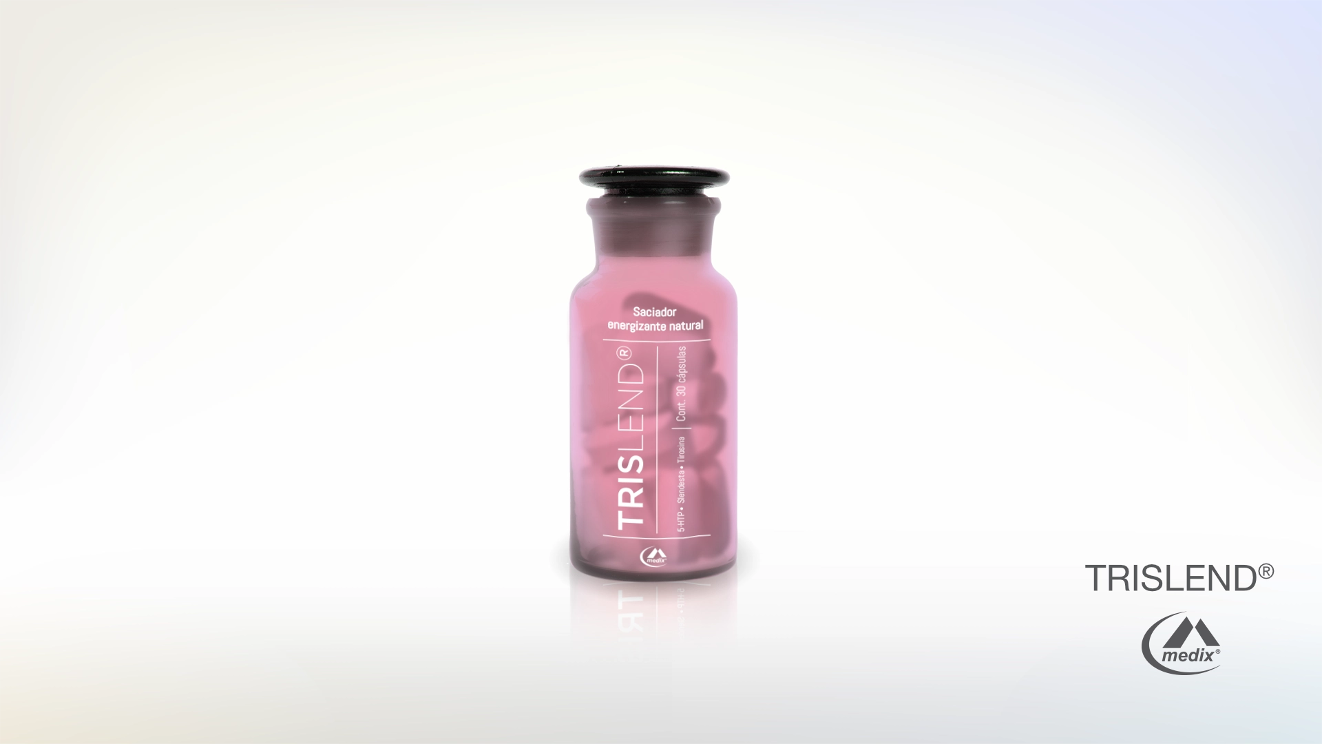
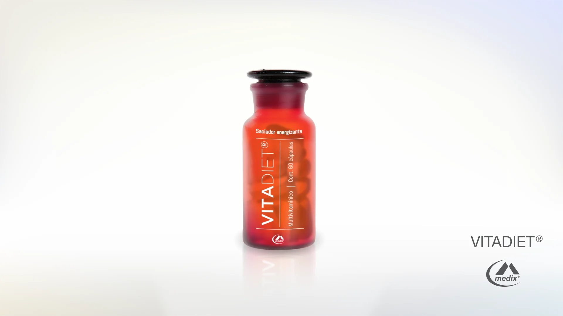
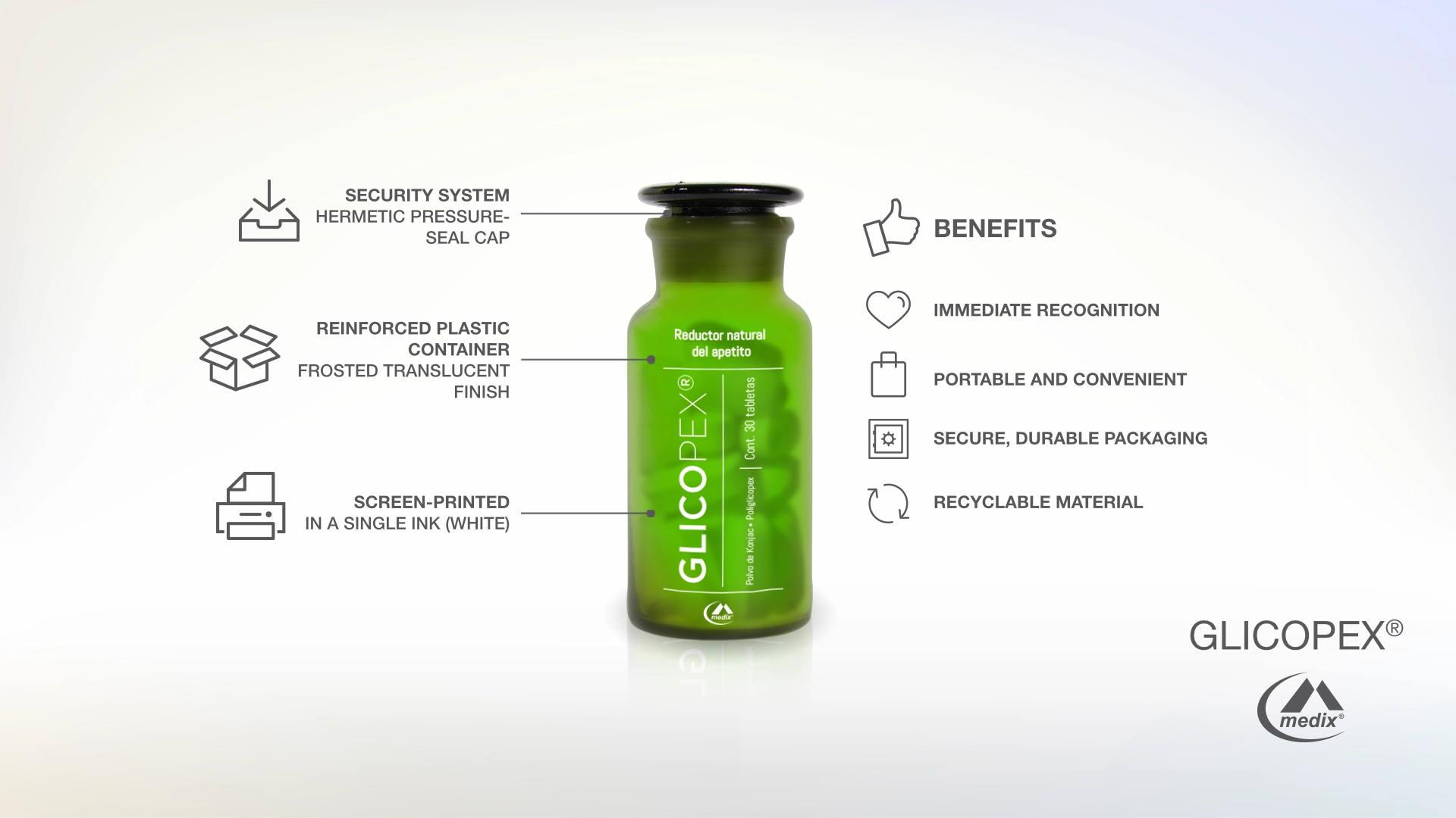
Medix, Mexico’s market leader in weight management with a 40% market share, needed to relaunch and expand its supplement portfolio under a unified brand architecture. The challenge wasn’t just aesthetic: the supplement category in Mexico suffered from low consumer credibility, cluttered retail shelves, and a tendency toward designs that read as either miracle-cure or generic pharmacy product. I developed the complete visual identity system for Suplemedix from the ground up: a 9-SKU line spanning appetite suppressants, fat burners, metabolic accelerators, and multivitamins. The solution was a color-coded apothecary-inspired packaging system that communicated health, premiumness, and clinical credibility simultaneously, with each SKU owning a distinct color while remaining unmistakably part of the same family. I conceived the structural direction of the bottle form, sourced the base container, and designed the full visual language across the line, which was subsequently handed to an in-house industrial design team for production development.
